

A brand style guide is the one-page reference that keeps you consistent everywhere a reader might find you: covers, website, social, email. Skip it, and every platform you touch ends up looking like it belongs to a slightly different author. Build one, and readers start recognizing you before they even register your name.
Many indie authors skip this step in the process entirely, and it shows. Their Instagram doesn’t match their newsletter. Their newsletter doesn’t match their book covers. A reader who loved book one has no visual cue, weeks later, that book two is from the same person. That’s not a design problem. It’s a recognition problem, and it’s easily fixable.
Here’s how to put one together, step by step.
Step 1: Define Your Vibe and Reader Promise First
Before you get lost in font pairings or color palettes, pause for a moment and ask yourself one simple question: What should a reader feel when they close my book?
Then, write down three to five words that describe that experience. If you're a thriller writer, you might choose tense, dark, and unnerved. A cozy mystery writer might go for warm, nostalgic, and magical. These words are a filter. Every design and voice decision going forward should be tested against them. A font that reads as "sleek and corporate" fails the test for a cozy mystery author, no matter how nice it looks on its own.
Once you've done this, identify exactly what sets your books apart in your genre. Whether it be recurring settings, a signature twist, or a particular kind of ending, it belongs in your brand style guide.
Then write one or two sentences naming who you write for and what you deliver. This will be your author brand statement, and it becomes the backbone of your entire brand: your author bio, your website's About page, your social posts, etc. Make it specific enough that it couldn't apply to any other author in your category.
Step 2: Lock in Your Visual Identity (and Stick to It)
Visual consistency is much more important than most authors give it credit for. A 2026 study in Frontiers in Psychology found that consistent visual design was linked to significantly higher brand recognition accuracy. Translation: the more your covers, site, and social profiles look alike, the faster readers connect them to you.
Pick two to three primary colors and one accent color, and grab their exact six-digit hex codes. Keeping those codes handy ensures your signature shade of red or blue looks identical everywhere, from a social graphic to your website. A romance author might decide to use blush (#FAA18F) and gold (#E1C14C). A thriller author might choose a dark background (maybe #0F0E0E or #2B2828) and a sharp, red accent color such as #EB1717.
Choose two fonts (one headline and one body) and use them everywhere, in digital and print. Google Fonts has hundreds of free, commercially licensed options that work well across a website, a social graphic, and a book interior alike.
If you have a logo or a headshot, spell out how it’s allowed to appear: minimum size, acceptable backgrounds, cropping rules. No logo yet? A consistent author-name treatment in one font and color combination works just as well, and plenty of successful indie authors use exactly that instead.

Step 3: Establish Your Voice Across All Platforms
Your voice doesn't just show up in your manuscripts. It shows up in your subject lines, Instagram captions, newsletter sign-offs, and the author bio on your back cover. When those all sound like different people wrote them, readers will notice.
To start, choose three adjectives that describe how you actually sound in your writing. Then, come up with one sentence for each of them, explaining what it means in practice. For example, "witty" might mean that your social posts are all centered around genre humor. "Straightforward" might mean that you express yourself through short paragraphs and never speculate or use buzzwords in your marketing copy.
While you're at it, lay down a few concrete rules for your author voice as well: perhaps your author bio will always appear written in third person, you'll speak conversationally and always use contractions in your social media posts, and you'll always speak more professionally to media outlets. You can change up your voice a bit from one platform to another, but the underlying voice should still be recognizably the same person.
Then write three sample sentences and put them in the guide: one casual (social media), one polished (a bio or blurb), one in between (a newsletter). These give you, or anyone writing on your behalf, something concrete to match instead of guessing.
Step 4: Build Your Essential Media Kit Ahead of Time
A style guide that only describes your brand in the abstract isn’t much use when a podcast host emails asking for a headshot and a bio within the next hour. Build the actual materials now, so they’re ready.
Start with the headshot. It needs to match your brand’s tone, and it needs to work in both square and horizontal crops, since platforms don't use the same dimensions. Get this right once and you won’t find yourself scrambling later.
Go ahead and build templates for whatever graphics you produce most: social posts, newsletter headers, bookmarks. Canva’s free tier lets you lock in your brand colors and fonts, so every new graphic stays on-brand without you having to think about it each time.
Create your author bio in three lengths: short (50 words), medium (100), and long (200). Keep them stored alongside your headshot, logo, and cover files in one folder. When someone asks for your materials, you can send a complete, on-brand package in minutes instead of having to assemble one from scratch under a tight deadline.
Step 5: Compile Everything into a One-Page Style Sheet
The best author brand guides are short…ideally only one page. If yours runs longer, you’ve probably included details that belong somewhere else, not in a document meant for quick reference.
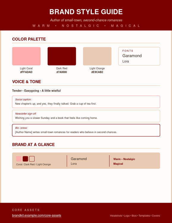
Structure your document in four sections: your brand statement and descriptive words at the top; your color palette (with hex codes) and font choices below that; your voice rules and three sample sentences next; and, at the bottom, links or filenames for your core assets.
Save a PDF version for anyone you’re sharing it with (cover designers, virtual assistants, newsletter collaborators) and keep an editable copy in Google Docs or Canva for yourself. Revisit it once a year, or any time a new release shifts your brand’s direction. A guide that reflects your current work beats one that only documents where you started.
Your Brand Style Guide might look something like this - basic but informative. You can make your one-sheet as detailed or as simple as you like.
What actually belongs in an author brand style guide?
Four things: brand identity (your statement, descriptors, and reader promise), visual identity (colors, fonts, logo rules, imagery), voice and tone (how you sound across platforms), and core assets (headshot, bios, templates, cover files).
Skip the 30-page version. The target is a document anyone can scan in under two minutes and apply immediately. A cover designer should be able to open it, know your colors and fonts, and get to work without a follow-up email.
TIP: Include a “do” and “don’t” example if you can. One graphic that fits your brand next to one that doesn’t will teach a collaborator more in five seconds than a page of abstract rules will.
Where does the guide actually get used?
Everywhere a reader or collaborator touches your brand: covers, interior formatting, your website, social profiles, newsletters, email signatures, business cards, promotional graphics. Anywhere your book marketing strategy shows up, the guide should be behind it.
That's the payoff of staying consistent: readers start to feel like they know you. And when someone spots your newsletter in their inbox and immediately thinks of the book they just finished, that's your brand working exactly the way it should.
Provide the guide to anyone creating materials on your behalf: designers, assistants, publicists, podcast hosts, etc. The more people working from the same document, the more consistent your brand stays across the parts you don’t directly control.
FAQs
Do you need a logo to build a brand style guide? No. A consistent author-name treatment works just as well for most indie authors, and plenty of successful ones skip the logo entirely.
How often should the guide get updated? Once a year, or whenever a new release shifts your brand’s direction. Small refreshes such as a new headshot or an adjusted accent color, keep it current without requiring a full rebuild.
Can this be done for free? Yes. Google Docs, Google Fonts, and Canva’s free tier cover everything needed to build a professional guide without spending money.
What about authors writing in more than one genre under one name? Keep the fonts and voice rules the same across the board; that's your throughline. Then let your colors flex: darker tones for a thriller line, warmer ones for romance, both still wearing the same fonts and name treatment underneath.
How long should the guide actually be? One page, for most authors. If it grows past that, split it: a one-page quick reference plus a longer appendix for asset files and extended examples.
Your brand doesn’t stop at the screen. IngramSpark’s print-on-demand infrastructure lets you produce hardcover, paperback, and ebook editions that hold to the standard your style guide sets. Consistent trim sizes, cover finishes, and interior formatting across your catalog reinforce the polished identity you’ve built everywhere else.
IngramSpark also offers free courses and guides that help you put these standards into practice. And its global distribution network means the brand you’ve documented travels with every copy of your book, into stores, libraries, and online retailers worldwide.
Building a brand guide might feel like extra admin work upfront, but it saves hours of second-guessing down the road. Give yourself an afternoon to lock in the basics. Your future self (and your readers) will thank you.