
Readers often judge a book by its cover—especially in today’s crowded marketplace. While it's true that content, reviews, and marketing all influence their final decision to buy, it’s the cover that first catches their eye. If your book cover looks dated, off-genre, or unprofessional, readers may pass it by without a second glance.
At one point, hot pink fonts and backgrounds were all the rage, and at another time, birds and florals were drawing readers in. Cover trends will always come and go, but there are some design styles that are still effective, regardless of those trends.
Bold Typography


Bold typography is a powerful choice for book covers across all genres. Whether you’re creating a suspenseful thriller with bold, striking fonts or crafting literary fiction with refined, graceful lettering, this design approach ensures your book immediately captures attention and sets itself apart from the others.
Why It Works
The key to bold typography is making the title and author name the main attraction. Designers achieve this through:
- Carefully chosen fonts that match the book's tone
- Strategic sizing that creates visual hierarchy
- Thoughtful spacing between letters for maximum impact
The Benefits
- This design style continues to succeed because it's clear and direct. Readers instantly understand what they're looking at, and a well-designed typographic cover signals quality and professionalism.
- Bolder type treatments—like oversized titles and experimental lettering—grab attention immediately. An added bonus: these designs stay readable and eye-catching even when displayed as small thumbnails online.
Minimalism


Minimalism is all about simplicity—stripping away non-essential elements to create a clean, uncluttered look. This style works especially well for nonfiction, business books, memoirs, and certain literary fiction, helping them appear calm and confident—even in crowded online bookstores.
Why It Works
- The basic idea behind minimalist design is simple: when there's less clutter, readers naturally focus on what matters most. With fewer competing elements, your eye goes straight to the title and any supporting image.
The Benefits
- Minimalist covers are particularly effective for ebooks. A clean, uncluttered design creates a more appealing and attention-grabbing thumbnail that stands out in digital stores.
- This approach also has lasting power. By keeping things simple, minimalist covers avoid following fleeting trends. This means they won't look dated as time passes—they remain fresh and relevant.
Illustrations


Hand-drawn or painted illustrations bring a warm, handcrafted quality to book covers that digital designs simply can't replicate. This style opens up endless creative possibilities and works beautifully for children's books, fantasy stories, literary fiction, and any book where imagination and artistic expression are key.
Why It Works
- Illustrated covers are works of art in themselves. Whether they feature whimsical watercolors, detailed pen-and-ink drawings, or bold graphic art, these covers appeal to readers who appreciate craftsmanship and want something visually appealing on their shelves.
The Benefits
- Because each illustrated cover is essentially a unique piece of art, it creates an emotional connection with readers. These covers often become collectible items that people treasure beyond just the story inside.
- This design approach has stayed popular for over a century because it speaks to something fundamental in us—our love for handmade beauty and visual storytelling. That timeless appeal keeps illustrated covers relevant generation after generation.
Iconic Imagery


Some of the most memorable book covers use a single, powerful image or symbol to capture the book's essence. Think of the eye in The Great Gatsby or the shark in Jaws. The goal is simple: create a lasting impression that makes the cover instantly recognizable.
Why It Works
- A strong central image quickly sparks recognition and emotional connection. The right image immediately tells readers about your book's tone, genre, or main themes—all without reading a single word.
The Benefits
- Covers with iconic imagery are easy to remember and describe. This makes it simpler for readers to share and recommend your book to friends, family, or on social media.
- By building your design around one powerful visual, your cover stays fresh and impactful over time. Unlike designs that rely on current trends, a strong central image remains relevant no matter how styles change.
Photographic Realism


Photographic covers are incredibly versatile, working beautifully across genres like romance, memoir, and true crime. They ground your story in reality and help readers instantly visualize the world waiting inside your book.
Why It Works
- The best photographic covers use images with strong composition, great lighting, and genuine emotion. Rather than simply placing a literal photo on the cover, the most memorable designs blend imagery in creative ways to achieve a timeless, iconic effect.
The Benefits
- Truly captivating photography has universal appeal. A powerful image speaks to readers across generations, creating an emotional connection no matter when it was taken.
- Professional photography also adds perceived value to your book. A high-quality photographic cover signals professionalism and quality to potential readers, helping your book make a strong first impression.
Vintage-Inspired
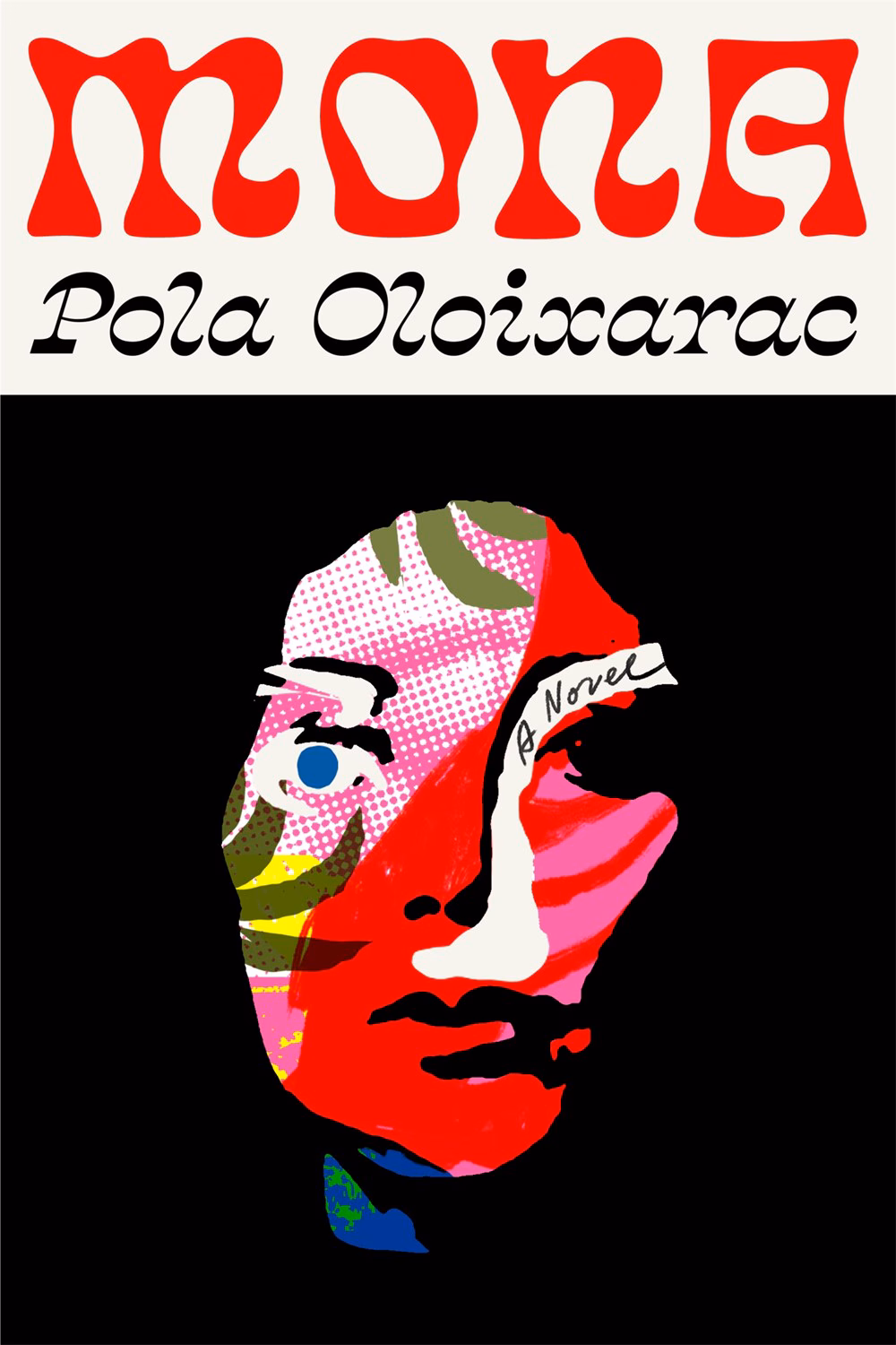
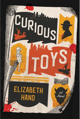
Covers that draw from earlier design eras tap into our nostalgia and love for classic aesthetics. Vintage styling works especially well for historical fiction, mysteries, and literary novels—though it can be adapted to fit any genre.
Why It Works
- Vintage-inspired designs can channel different time periods, from the Art Deco elegance of the 1920s to the bold advertising style of the 1950s or the psychedelic look of the 1970s. These covers give books an instant sense of timelessness and character.
- They typically feature period-appropriate typography, color palettes, textures, and design details that perfectly capture the spirit of a bygone era. The beauty of this approach lies in a fascinating contradiction: by thoughtfully embracing an older aesthetic, the covers actually stand out as fresh and unique in today's market.
The Benefits
- Vintage covers invite readers to appreciate their artistry and thoughtful design details. This creates a dual appeal—they feel both comfortably familiar and distinctively unique at the same time.

Monochrome or Limited Palette


Monochrome or limited palette covers are one of the most enduring design choices in book publishing. They strike a perfect balance between simplicity and visual impact.
Why It Works
- These covers rely on fundamental design principles: readability, focus, and emotional color resonance. By using just one or two colors with variations in shade and contrast, they create designs that are striking without being busy—resulting in a classic, elegant feel.
- Color psychology plays a significant role here as well. Deep blues suggest mystery or calm, reds evoke intensity or passion, and muted earth tones convey history or literary depth. The right color choice immediately sets the mood for your book.
The Benefits
- Limited palette covers have timeless appeal. By avoiding over-complicated color schemes, they maintain an elegant, classic look that doesn't feel dated.
- A bold, singular color scheme creates instant recognition. Your book will stand out on bookshelves and in thumbnail displays online.
- This approach also offers practical flexibility. These covers work equally well in both print and digital formats without losing clarity or impact.
Patterns


Repeating patterns, decorative borders, and wallpaper-style motifs bring rhythm, texture, and visual richness to book covers. This style works particularly well for historical fiction, cozy mysteries, romance series, and young adult novels.
Why It Works
- Patterns can take many forms—geometric, floral, abstract, or thematic. They might draw directly from the book's content or simply create beautiful visual interest that catches the eye.
- This approach is especially effective for book series. Consistent pattern treatments help readers instantly identify which books belong together, building brand recognition across multiple titles.
The Benefits
- These covers typically photograph well, and their visual density and energy make them stand out, whether displayed face-out in a bookstore or as thumbnails online.
- Patterns have enduring appeal because they've been part of artistic expression for generations. From ancient mosaics to modern wallpaper, people are drawn to repetition and variation. That timeless quality keeps patterned covers fresh and engaging.
Strong Color-Blocking


Color blocking uses solid areas of bold color in clear, defined sections—no gradients or blended transitions. When done well, color-blocked covers feel confident, modern, and impossible to ignore.
Why It Works
- This approach offers several creative options. Designers might pair complementary colors for maximum contrast, use varying shades of a single color for sophisticated unity, or divide the cover into distinct colored zones that create visual interest.
- Color psychology plays an important role here. The chosen palette communicates genre expectations and emotional tone before readers even process the title or imagery.
The Benefits
- Strong color choices help books stand out both on shelves and as online, where clear visual differentiation is essential for catching a browser's eye.
- This style has lasting appeal because it relies on fundamental design principles and the psychological power of color rather than trendy effects or temporary stylistic flourishes. That foundation keeps the covers feeling fresh and relevant, no matter when they're created.
Trends in cover design may rise and fall, but the nine approaches we've covered here have truly stood the test of time. What makes these styles enduring isn’t that they ignore what’s popular; it’s that they’re rooted in timeless design fundamentals—clarity, emotional connection, and strong visual storytelling. The most important thing is to choose a style that aligns with your book’s genre, voice, and audience.
When you pair the right approach with thoughtful execution, your cover won’t just attract readers now—it'll keep drawing them in for years to come. You don’t need to chase passing trends; instead, simply focus on clear communication, genuine emotion, and making your book shine confidently on any shelf.