The notion of setting type might belong to another era, but with the advance of technology, it’s more relevant than ever. Ironically, technology is the reason that typesetting matters today: increased exposure to (sometimes) beautiful typography in books, magazines, and marketing materials, not to mention websites, has raised our collective expectations regarding appealing type. Even the uninitiated among us can easily pick out poor font choices and bad formatting. So, what exactly is typesetting—and why does it matter for self-publishers?
What Is Typesetting?
According to Merriam-Webster, typesetting is “the process of setting material in type or into a form to be used in printing.”
Back in the day, moveable type was set by hand, per page. We’re all familiar with pictures of metal type, one letter per block. Manual typesetting was very time-consuming, and while still in practice today, is considered an artisanal pursuit and a niche market.
 To bring us into the digital age, Merriam-Webster adds to its definition of typesetting the following: “…the process of producing graphic matter (as through a computer system).” First typewriters and then computers redefined what it meant to set type and democratized the activity of setting words into print. With the introduction of the Apple Macintosh computer in the early 80s, along with the laser printer, the beautiful type was available to the common person. Traditional typesetting was still the industry standard, however, as the print quality of a “Mac” and a laser printer could not match that of a well-typeset product.
Today, the common word for book typesetting is “formatting,” which seems to imply that the task requires little skill. Print quality has increased dramatically, and even a Word document comes out looking pretty good, at least to the untrained eye. Software such as Adobe InDesign and—the bane of any designer’s existence—Microsoft Publisher, allow anyone to become would-be book designers.
The industry term is “book page composition” which is far more involved and why typesetting matters even more than ever.
Why Typesetting Matters
Typesetting is more than just the tools; it’s also about the rules.
Typesetting has its own set of rules that must be followed for a professional look.
Many of these rules have carried over from the days of traditional typesetting. Following the rules ensures high-quality, readable print and eBooks.
While Word and other word processors have helped to make typesetting available to everyone, they do not follow the rules.
Adobe InDesign, the professional design software, has settings to allow designers to follow the rules, but only if the designer knows what settings to adjust. Experienced typesetters rarely use the software at the default settings. Trained to see the difference between “so-so” type and great type, they adjust the settings for the best results, sometimes paragraph by paragraph, line by line, and even word by word—a grueling yet satisfying activity that harkens back to traditional typesetters.
But who really cares about that? Isn’t the content of the book more important than its appearance?
Will the reader really care about page design and typesetting if they loved the book?

Readability Is Important
It may sound silly to worry about hyphens, widows, orphans, tight and loose lines, and all the other “rules” of typesetting, but they have one thing in common: these aspects of book page composition exist to minimize nanosecond-long pauses that distract the reader.
A good book on the subject (and a good remedy for insomnia) is Type and Layout by Colin Wheildon, a survey of clinical studies that established the relationship between good and bad typography to reading comprehension.
Here’s one example of how formatting or book page composition can impact readability.
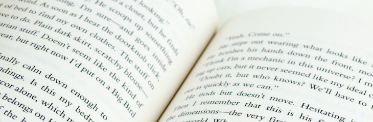
Did you know that serif fonts—those with a decorative stroke that finishes each end of a letter (think Times Roman)—are easier on the reader’s eye than sans serif fonts, those without the extra strokes?
That’s because the stroke, known as the serif, leads the reader’s eye from one letter to the next, making it easier for the eye to follow along the line of text. Reading a line of text printed in sans serif (think Helvetica or Arial) is more tiring. Yet, how many books have you seen with a sans-serif font in the main body because the author preferred it that way?
Sans-serif fonts should be reserved for headings or other limited uses.
Here are some of the other rules defined:
- The book block: In a book, the text is confined to a tightly defined area on the page called the book block, where facing pages usually end on the same line. The exception may be the last page of a chapter.
- Margins: The white space around the entire book block. White space is important and generous margins around the book block allow the eye to move comfortably from one line to the next.
- Alignment: Text must line up across the page. Book designers spend a lot of time adjusting the line spacing to make sure this happens, especially if there are headings and subheads, lists and illustrations.
- Line spacing: Lines of text that are too close to each other (or too far apart) are difficult to read.
- Paragraph spacing: In most cases, there should NOT be a line of space between paragraphs. Indicate the beginning of a new paragraph by indenting the first line. Space above a paragraph can be used sparingly to indicate a scene change or a new section. Whenever there is a blank line above a paragraph, eliminate the first-line indent on that paragraph.
- Widows and orphans: The first line of a paragraph shouldn’t fall on the last line of a page, and the last line of a paragraph should not go over to the top of the next page. Widowed and orphaned lines make the reader pause, thus impeding reading comprehension.
- Lines after a subhead: When a subhead appears at the bottom of a page, it should be followed by at least two lines of text while still maintaining the book block. Like widows and orphans, leaving orphaned headings is a no-no.
- Word stacks: Word stacks are when the same word appears in the same position in three or more consecutive lines. These are fixed by adjusting word spacing or rewriting the text.
Book page composition involves many other rules, including proper use of special characters such as em and en dashes, hyphenation, kerning, true quotation marks, alignment, justification, and much more.
Attention to these details, along with the design sense of a professional who will make your book look attractive and unique, ensures a pleasant reading experience for your audience.
This leads me to why typesetting is important to authors: book sales.
The Importance of Typesetting to Authors
How will people know if the book is readable or not before purchasing it? The Amazon Look Inside feature gives people a peek at the book page composition, making it a part of their buying decision. There’s no hiding anymore; readers recognize a do-it-yourself job. You may lose your reader due to poor formatting, even if the story is good.
The author’s goal for the book can determine which route to take with regards to typesetting. If book sales are not important (e.g., the book is likely to be distributed to friends and family only), authors may opt to save money by doing the formatting themselves.
However, if the book is meant to compete with bestsellers in a genre, or has been produced as a marketing tool for a business or to promote the author as a thought leader, book quality is of premium importance. The book is a mirror of the author; sloppy book page composition reflects directly on the author. In this case, the author may wish to consult with a professional book designer to achieve the optimum page design and best reading experience for their audience.