I’ve recently gone through the book cover design process for my new novel, and it has made me more aware than ever of just how much information the cover has to communicate in a very short time. Although this is my second novel, it’s my first as an indie author, so it was the first chance I’d had to see the process the whole way through.
I chose to work with an Australian graphic designer, who also did the book cover for my first novel. The two books are both Gothic mysteries, but they’re standalone, not a book series, which would become important in the design.
Key Elements of Book Cover Design
Genre is essential to the cover design. The genre determines certain design standards that readers of that particular book expect to find when searching for their next read in their preferred genre. If your Gothic mystery, romance, fantasy, or literary fiction title doesn’t look similar to the books they’re used to reading in those genres, they’re not likely to pick it up in the first place.
 The content of your story is also essential to the cover design because including subtleties of your plot, themes, characters, or tone is a good way to intrigue readers from the beginning and foreshadow what’s to come within your book’s pages. The Iron Line, my new novel, is set in New South Wales, Australia, in the 1880s. It follows a young woman who arrives in the small town of Tungold as its new level crossing operator. Almost immediately, she’s warned about a ghost train, and shortly after her arrival, a railway official is murdered. It’s up to her to find out the truth about Tungold’s mysteries, but things aren’t always quite what they seem.
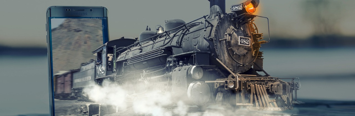
The ghost train is a major theme of the book, and consequently, I wanted it featured on the book cover. This was one of the first concepts my designer sent me, and I absolutely adored it (and still do!). I love the colours, and the shading on the font. There was just one problem.
Ask the Audience
I polled other authors in an indie Facebook group about what genre they thought the book was, based on this cover, and overwhelmingly they said ‘time travel’. Although it’s gorgeous, the bright colours implied fantasy, and it just wasn’t conveying ‘historical mystery’ enough. So it was back to the drawing board.
Book Cover Design and Author Brand
The next cover concept had a much more mysterious flavour to it, but in colouring and design, it was very similar to that of my first novel, Greythorne.


This was a problem because it made The Iron Line look like a sequel, when in fact it’s a standalone set in an entirely different country and with different characters. The image of the train, however, was fantastic.
 After a few more iterations, we eventually came up with this final version. It kept the mysterious train image, which conveys the genre very effectively, but also ties into my first novel through the use of the cloudy sky and moon, as well as the white title font and gold colour of my author name, without looking like a sequel. I love how, when they’re side by side, it’s clear that they’re by the same author, helping reinforce my author brand, but they’re not part of the same series. These nuances are why fiction covers are notoriously difficult to design, and in my opinion, being able to achieve this level of subtlety is what makes a professional cover designer worth every cent.
Whether you're able to hire a cover designer is dependent on your individual budget. Keeping these tips in mind and understanding the process is an important first step. Now get out there and go publish yourself!