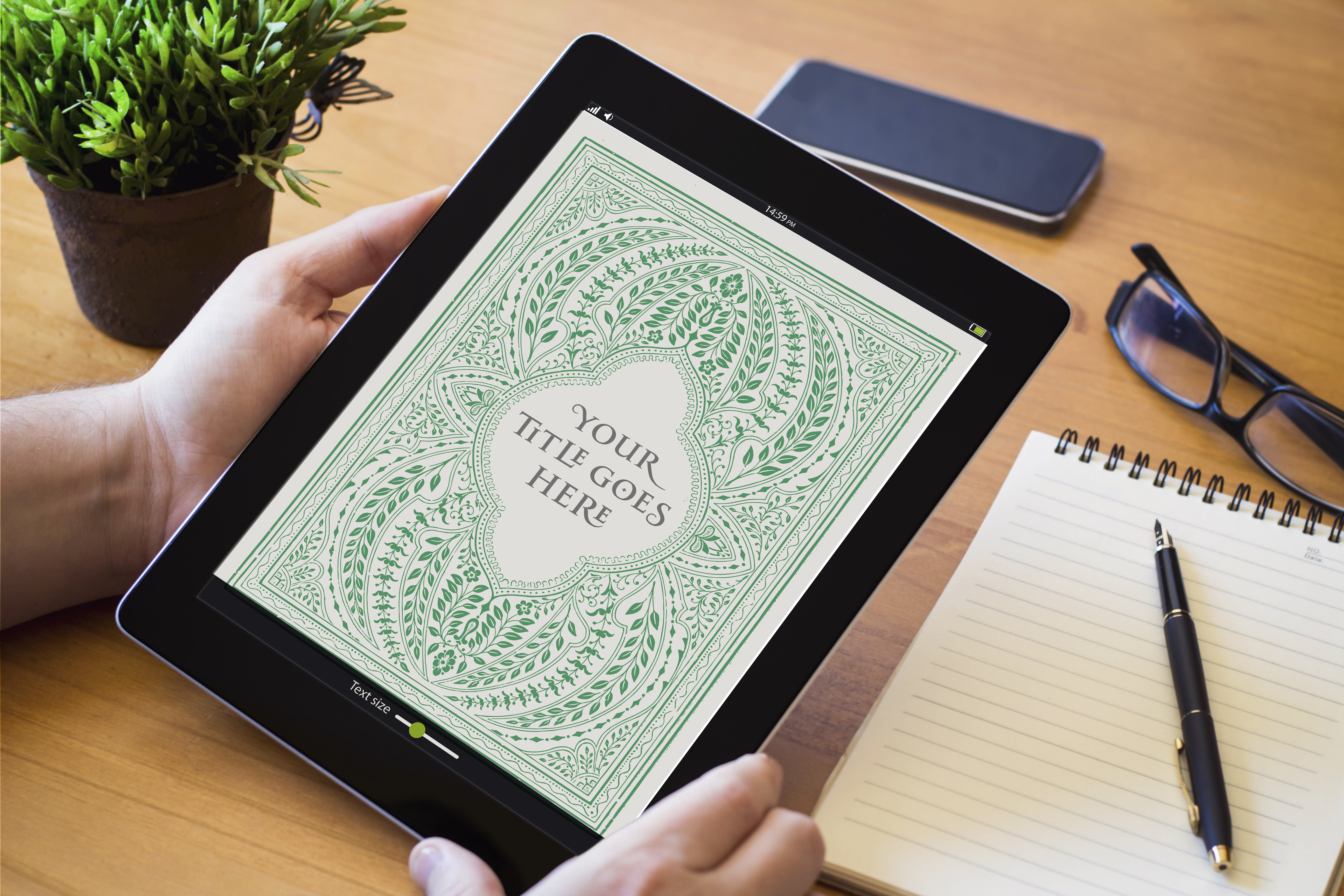
Whether it’s on a small phone screen or a large desktop, your ebook cover needs to grab attention and pique the reader’s interest. While the print cover and ebook cover are usually the same, the design approach is different for each. For the print cover, there are numerous factors to consider, such as paper type and texture, colors, embossed or debossed lettering, the spine, and back cover design. The ebook cover design doesn’t have those concerns but must still communicate effectively and attract the reader.
Print and Ebook Covers
If you've already published your book in print and are now publishing it as an ebook, you will need to decide if you want to use the same cover or create a new cover for your ebook. If you keep the same cover for both formats, you're staying consistent and making sure that only one image is associated with your book. However, what draws people in at the bookstore may not be as eye-catching online.
When readers scroll through ebooks in an online store, your ebook cover could appear as small as a postage stamp! That’s not much space to work with, so you have to focus on the bare essentials.
Clear Text
Your ebook cover is no place for fancy fonts and loopy lettering. When scaled down to a small size, titles with unique typography become illegible. Unless your cover has a recognizable symbol or image and doesn’t depend on the text, you should make sure that your title and name can be clearly read at a small size.
Black and White
The use of colors in your book cover is important and can communicate a lot to the reader. Designing with color in mind should be the first priority. Depending on the e-reader or device people are using, your ebook cover might be displayed in black and white. With this in mind, it is important to remember to design with colors and images that will translate well into black and white and will not allow the title to get lost.
Contrast
Whether it’s black and white or rich colors, contrast is always a great way to catch the reader’s eye. Contrast is most noticeable when dark and light are right next to each other, like black and white without any grays. Complementary colors also show contrast, like red and green, and blue and orange which appear opposite of each other on the color wheel. Before you start having too many flashbacks of elementary art class, think about how contrast appears differently in real life versus online. For example, a print book cover with warm, brown tones and embossed gold lettering can look high contrast in real life because the gold reflects light and appears shiny to your eyes. Take that same book cover, put it online, and you will not end up with the same effect. The gold lettering can’t reflect light as a digital image. Online, that book cover’s lettering might be too close to the warm, brown tones to show up clearly. So regardless of whether or not your ebook cover will be in black and white or color, or both, contrast will help your ebook cover stand out.
Back Cover
A print book will have a front cover, a spine, and a back cover that needs to be designed. An ebook must have a front cover, but does it need a back cover? It is wise to design one; however, some online stores and apps will not display the back cover unless a person buys the book. Even if the back cover can be viewed before purchase, many people will not go looking for the back cover of an ebook. Basically, it's good to have, but don’t expect it to be seen.


